Increasing team adoption rate by 33% with an internal design system guideline
The design system Ahua is equipped with fast and responsive components to accommodate devices with low capabilities. Its thoughtful UI considerations, including color and font choices that remain visible under sun glare, as well as meticulously crafted language and visuals, respect our users' local heritage.
Ahua was launched a few months before I joined, but adoption among product teams was not smooth. Increasing Ahua's adoption thus became the main goal of my internship. Through extensive research and a deep dive into the needs of product teams, I led the creation of a design system documentation website. This platform aimed to bridge the gap, providing product teams with valuable insights on how Ahua can enhance their workflows and contribute to impactful designs for the rural community.
Overview
Duration
3 months
Team
Alexander Toporov
Nicole Lin
Roopal Jain
Bikramjit Dasgupta
Ahmad Nurhadi Rahim
Vanessa Zevania Zheng
Ayumi Lee
Tools
Competitive evaluation
Asynchronous workshop
Information architecture
Low-fidelity prototype
High-fidelity prototype
Platform
Desktop
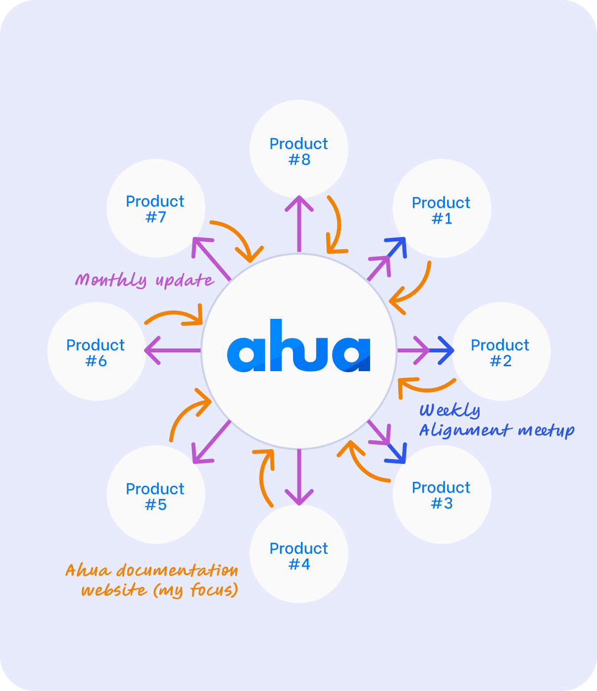
A stakeholder map indicating the influence between product teams and Ahua
Influencing stakeholders to adopt our Design System Ahua in three ways
At Yara International, where a diverse range of digital agricultural solutions is managed by 8 distinct product teams, each team possesses its unique design culture and practices, sometimes even maintaining individual design systems within their product lines.
We took the first step to foster this Design System and Product team relationship. Recognizing the potential challenges of integrating a new Design System within tight work schedules, we proactively introduced supporting processes. These initiatives aimed to facilitate a seamless migration to Ahua, ensuring that teams could embrace the system without disrupting their established workflows.
Launching collaborative initiatives to help product teams migrate to Ahua
Weekly alignment meetups
As our first initiative, we ran component audit weekly with three product teams, collect major inconsistencies, and point them towards Ahua best practices.
Monthly Design System Update
Regular updates that ensure the design system remains current and relevant to our stakeholders
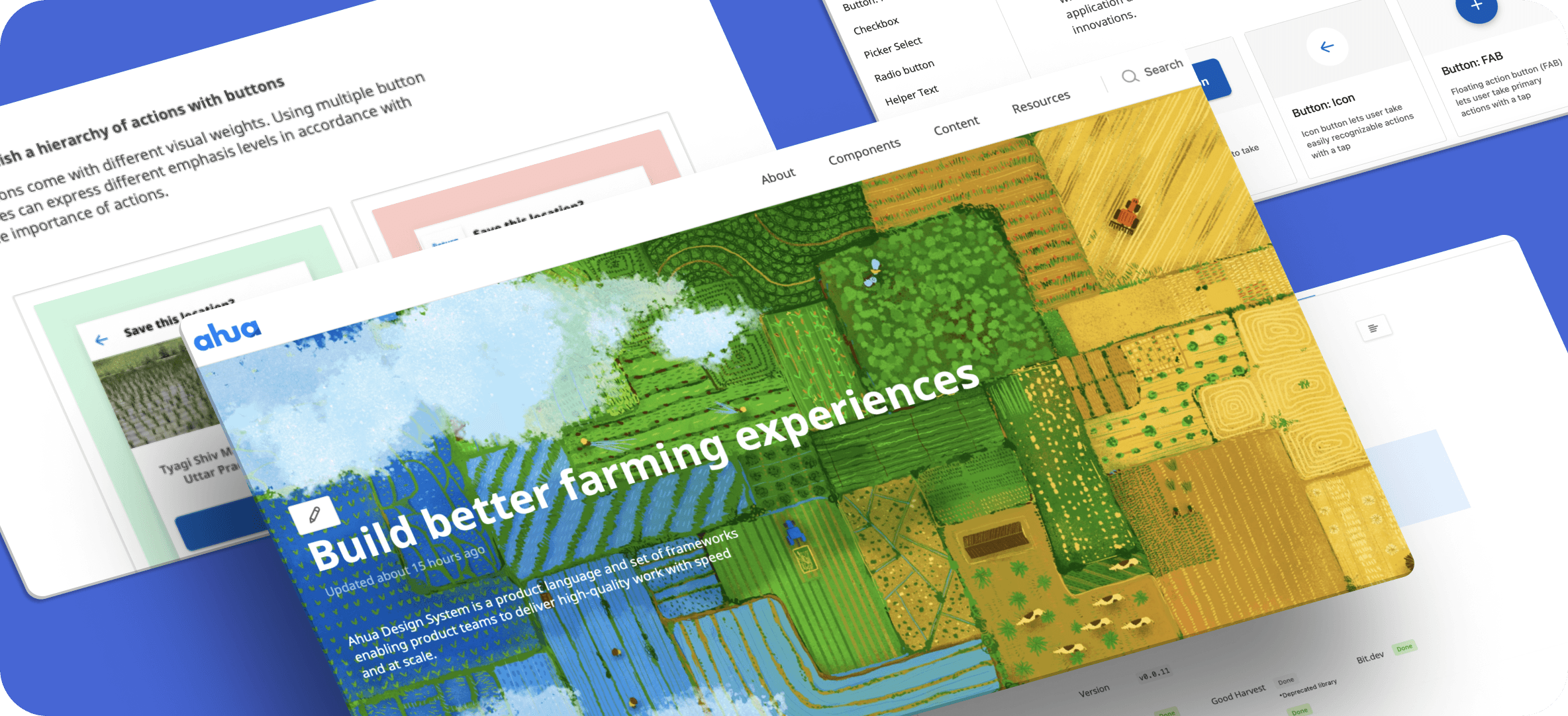
Design System Documentation Website
A informative website covering Ahua’s value, component guidelines, and UX writing recommendations.
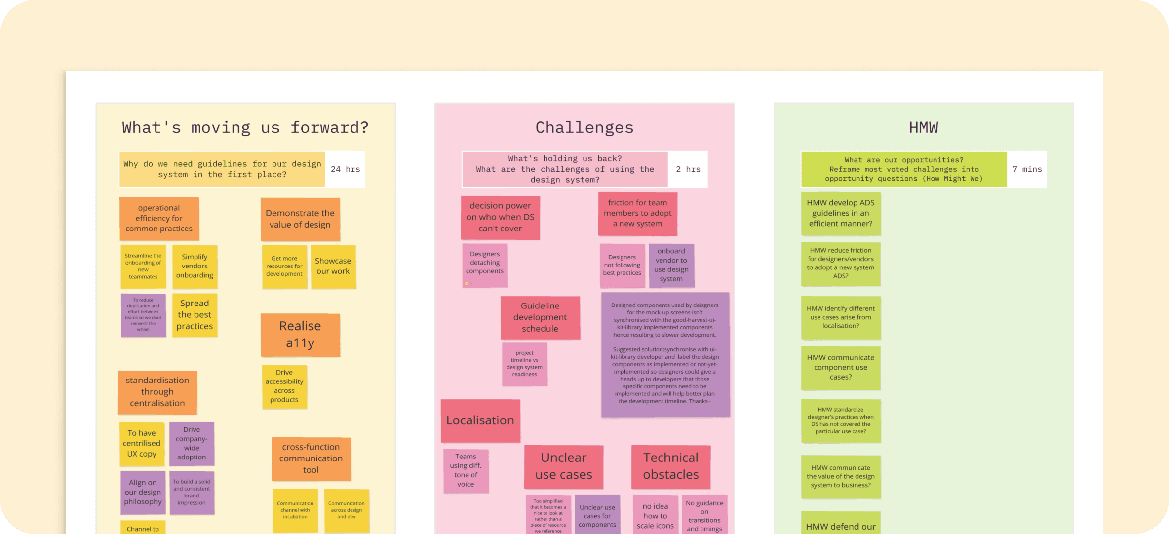
Hosting an asynchronous workshop amidst covid to access product team needs
The workshop was held on Miro asynchronously and involved 20+ engineers, designers, and product managers. These feedback are reflected in the documentation’s website information architecture and component guideline. For instance, later on we included “Resources” under the documentation website to direct product teams to developer-ready library, Design System request, and meeting schedules to realise operational efficiency and readily assist product teams when Ahua cannot cover certain edge cases or interaction patterns.
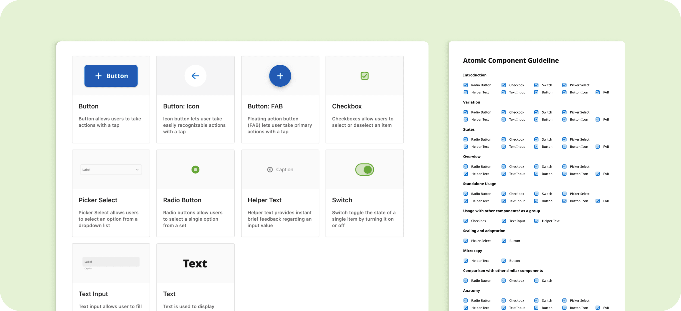
Choosing the first 10 component guides to cover based on alignment meetup feedback
Given we only have 3 months to launch, we prioritised components that are used broadly and commonly misused. Our conversations with product teams during weekly alignment meetings also helped us identify content to cover in the guideline.

Designing a wireframe kit in Figma for future designers to generate component guideline easily.
A successful design system grows with products. Therefore, I have created a component guideline wireframe kit in Figma for Yara designers to easily create component guidelines in the future. They can focus on the idea and simply drag and drop the section block they need into the guideline frame.
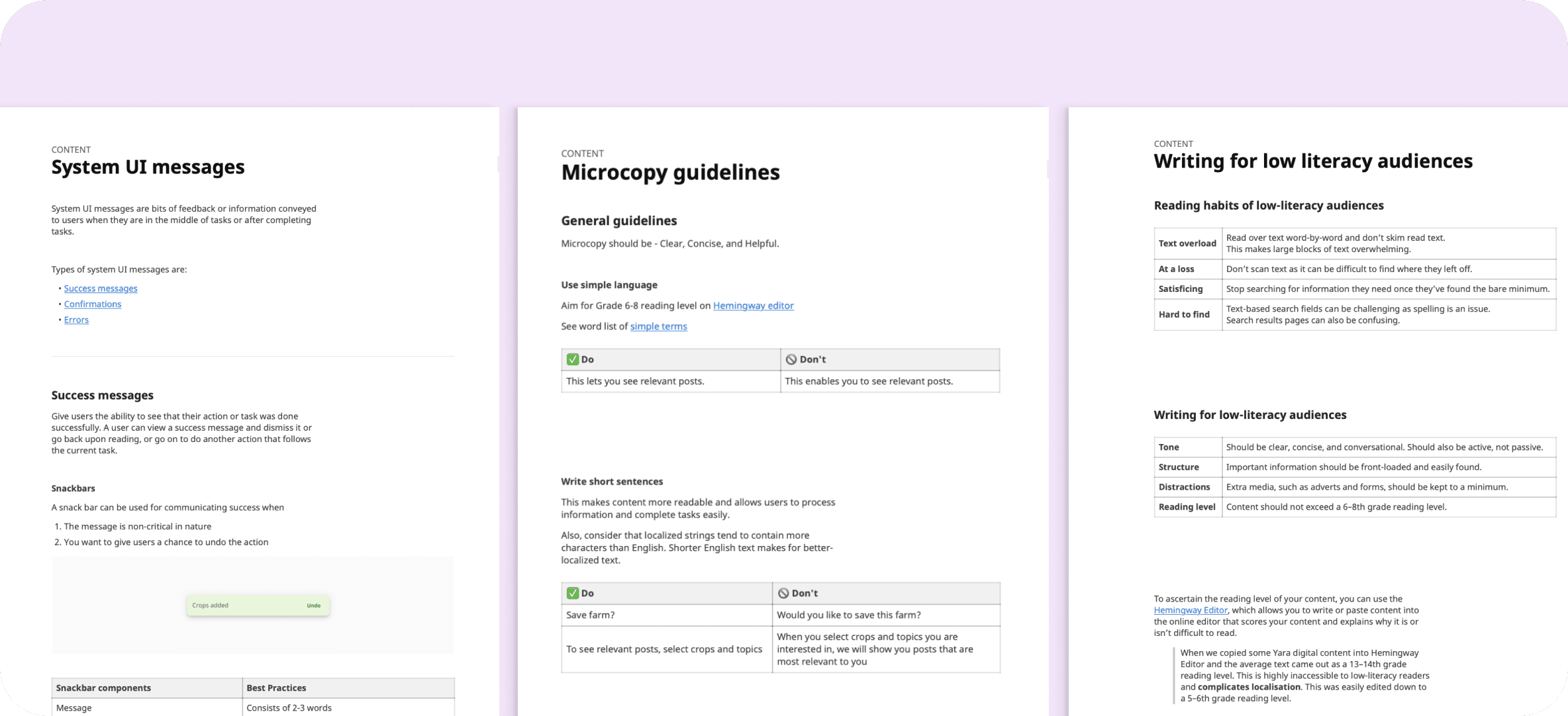
Working with UX writers to create content guidelines tailored for farmers.
Content guidelines mainly focus on techniques in writing for low literacy audience, crafting effective and concise system UI messages and microcopy, and a suggested list of words to use. These guidelines are often illustrated with component use cases for higher readability.