
Trace your order with ease by reducing design variables by 45%
We redesigned status indicators for conciseness and simplified information into easily digestible bits. Through distinct labels, users can navigate their orders with a sense of priority, responding more efficiently to the complexities of their crypto transactions.

Overview
Duration
3 weeks
Team
Samuel Wong
Raymond Theodores
Cissy So
Ayumi Lee
Tools
Competitive evaluation
Heuristic evaluation
Design system
High-fidelity prototype
Platform
iOS
Android
Desktop


Presenting the right information at the right time
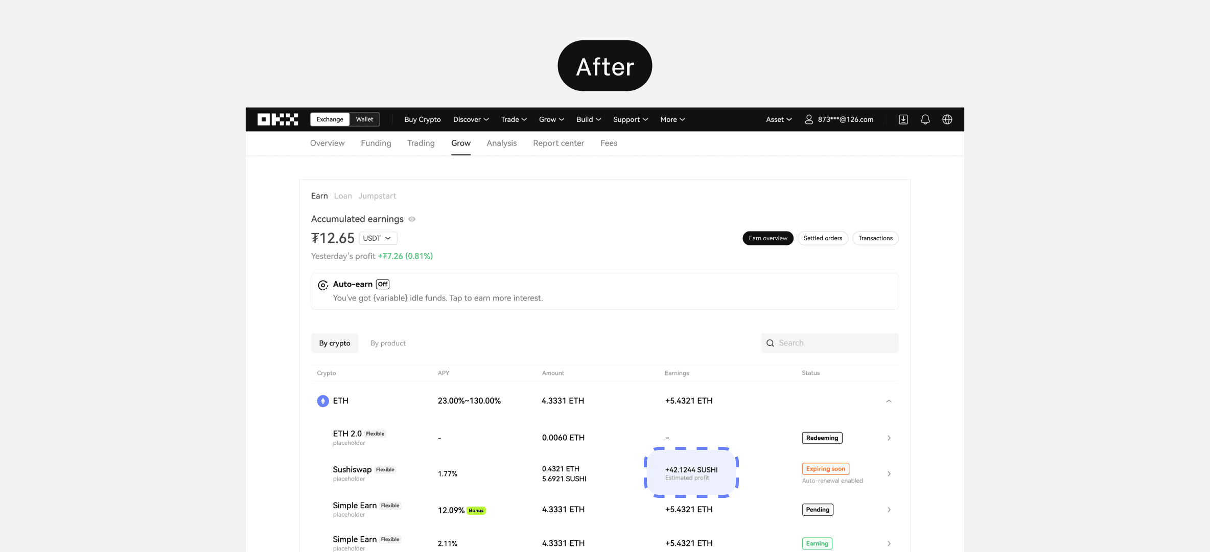
Every extra unit of information in an interface competes with the relevant units of information and diminishes their relative visibility. We restructured and filtered information that is are strictly relevant to product logics, and informs users only the most essential statuses.
To helps users quickly scan through different products, we colour-coded these tags based on urgency and importance. For instance, products earning users interest are highlighted in green, while products transitioning between phases are given a neutral branded grey.

A good description is worth a thousand words
Upon conducting a heuristic evaluation with our Content Designer, Cissy, we realised a lot of description listed in bottom sheet could not effectively communicate can returns mean to users despite the length.
The most important clarification users need is whether the returns have been realised. We hence move “estimated amount” to the top layer.
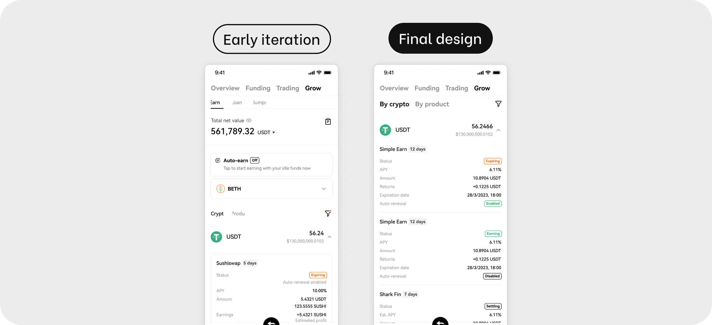
Improving clarity for auto-renewal status
In our initial design phases, we used a text label to convey the status of auto-renewal, adopting a similar strategy as we did for representing estimated profit.
However, through iterative design reviews, we discovered that this method proved less efficient in clearly differentiating between two scenarios in the absence of a text label. Users faced difficulty discerning whether a product inherently lacked auto-renewal or if the feature had not been activated. Hence, we opted for a more intuitive solution by implementing tags to distinctly signify the status of the auto-renewal function.
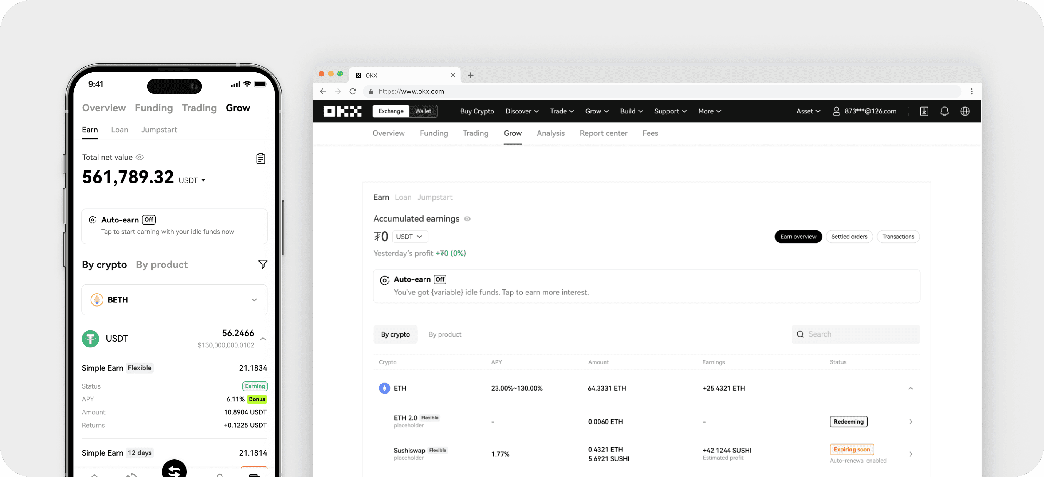
Complemented with app design
Upon delivering high-fidelity User Interface designs and content variations, I also prepared the complementing app designs to create a unified order tracking experience.